No Nonsense Screen Printing
By Richard Wardle R.E.
 I began printmaking
20 years ago at Harrow Art School where I was firstly taught to use
paper stencils then photo stencil film. After a few weeks most students
had given up, frustrated by problems of registration and the barrier
of cumbersome photographic stencil making. It was with the arrival of
a new tutor, Michael Carlo, that I became hooked on his no-nonsense
approach. I started to work on one hinged screen, painting stencils
directly onto it, using blue filler and printing overlays of transparent
colours using extender base. I still use much the same process now and
am still using oil-based inks though I have completely eliminated general
cleaner and other heavy solvents from my printing practice. Instead,
I use white spirit with a little genuine turpentine mixed in to clean
my screen.
I began printmaking
20 years ago at Harrow Art School where I was firstly taught to use
paper stencils then photo stencil film. After a few weeks most students
had given up, frustrated by problems of registration and the barrier
of cumbersome photographic stencil making. It was with the arrival of
a new tutor, Michael Carlo, that I became hooked on his no-nonsense
approach. I started to work on one hinged screen, painting stencils
directly onto it, using blue filler and printing overlays of transparent
colours using extender base. I still use much the same process now and
am still using oil-based inks though I have completely eliminated general
cleaner and other heavy solvents from my printing practice. Instead,
I use white spirit with a little genuine turpentine mixed in to clean
my screen.
I still work on one screen only, altering or eradicating each stencil to
make the next one in its place and sometimes use at least 30 stencils to complete an
edition. Therefore, my prints are not photo-mechanical semi-reproductions (which seems to
be the present trend), but developments of paintings which may be either rough colour
studies or more complete paintings. Due to the nature of the medium, the prints are always
different from the paintings.
I have seen many prints in recent years that are scanned, printed by
technicians and end up being facsimiles of paintings, hardly meriting the term Original
Prints, though they are sold as such.
I have been making paintings and prints of landscape since 1978 and give
demonstrations wherever I exhibit. Generally, viewers are surprised and fascinated by such
an apparently basic method. Most people expect my prints to be photographically separated.
Most of my works depict rural England and I try to suggest in these images the specific
moment when I find a good or interesting subject, i.e. when the elements of that subject
come together because of the time of day. I rely heavily on lengthening shadows which are
both cast by features of the landscape and lie across and over other features. It is often
the shadows that create the illusion of 3-dimensional space on the flat surface of the
paper. The feeling of specific time may come from going out to look for material in
evenings and early mornings. I often find shadows appearing, cast by features which aren't
even visible in the composition and I also enjoy tonal play of light against dark and dark
against light.
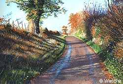
 These two prints
started as small paintings. 'Angel Bank' (Top) was only about 5"x
7" and was a very direct, busy painting. I re-drew a larger version,
lightened the shadows which were too harsh and moved some things around,
rather like moving furniture, leaving some things out and working from
the lightest colours to the darkest using overlaid inks. The finished
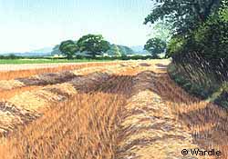
print used 28 colours, so I hand-painted 28 stencils. 'Field Side' (middle)
is smaller than the painting and lighter in tone and feel, as I decided
I had again over-cooked the colour and tone in the painting.
These two prints
started as small paintings. 'Angel Bank' (Top) was only about 5"x
7" and was a very direct, busy painting. I re-drew a larger version,
lightened the shadows which were too harsh and moved some things around,
rather like moving furniture, leaving some things out and working from
the lightest colours to the darkest using overlaid inks. The finished
print used 28 colours, so I hand-painted 28 stencils. 'Field Side' (middle)
is smaller than the painting and lighter in tone and feel, as I decided
I had again over-cooked the colour and tone in the painting.  Distant stacks of bales stand
out in front of darker tones (right) . The transparency of the ink is
perfect for suggesting the overlays of watercolour marks.
Distant stacks of bales stand
out in front of darker tones (right) . The transparency of the ink is
perfect for suggesting the overlays of watercolour marks.
Screen-printing seems for most people to be out of reach, too technical,
using specialised photographic equipment and relying on chemicals. The way I was taught
and now teach myself, gives students access to this very direct medium.
A well-known artist-'printmaker' once said to me having watched me
demonstrating how I work, "that’s amazing. All my prints are photographically
separated and printed by some-one else". Unfortunately, nowadays the term Original
Print can mean just about anything.
You can see Richard demonstrate his techniques
at Art in Action in July.
You can contact Richard at:
3 Seifton Lane
Culmington
Ludow
Shropshire SY8 2DG
England
Tel: 01584 861634
 The information resource
for printmakers
The information resource
for printmakers 